24+ Midcentury Kitchen Backsplash
ID# 170407 | Houzz.com – Credit | © Peter Schaad Design Studio
Modern Midcentury Kitchen Backsplash with Green and Wood Cabinets
If you don’t want to use tiles for your backsplash but still want to emphasize this area, using a different colored paint might be a great way to achieve this goal! In this mid-century modern kitchen, the gray-painted backsplash area differentiates itself from the white upper walls while the white quartz countertops create a continuous look with the backsplash. Enriched by brushed nickel hardware and stainless steel appliances, the sage green base cabinets add a nice color to enhance the overall design. The wood upper cabinets complement the natural sense of the green while the brass lighting fixture between the cabinets emphasizes the midcentury flair.
ID# 170412 | Houzz.com – Credit
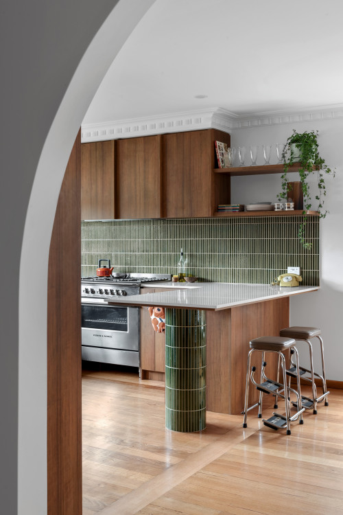
Kit Kat Midcentury Kitchen Backsplash with Open Shelving and White Countertops
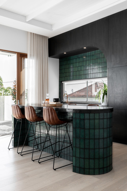
The prevalent narrative of the kitchen is built upon wood cabinets as the streaming lights cast a shadow upon the space. The beauty of the green Kit Kat tile backsplash with white grout composes a nice textural background and continues to clad the stand of the peninsula to enhance the overall look. The stained wood cabinets and two layers of wood floating shelves create extra interest while the stainless steel appliances and stools introduce different materials that dictate the character of the design.
Midcentury Kitchen Backsplash
Having started in the 20th century and inspired by the Bauhaus movement and modernism, the mid-century movement encompasses a period from the 1930s to 1960s and it continues to partake in our lives through the well-known TV shows like Mad Men and Queen’s Gambit and IKEA products (present in almost every home) that find inspiration in the mid-century movement. So, this shows that over time mid-century modern has not never lost its impact. This is mainly because it emphasizes sleek and minimalist lines and functionality without compromising aesthetics. To see how, in this article, we will be exploring the midcentury movement through a midcentury kitchen backsplash by discovering many design projects.
Charming Style of the Midcentury Aesthetic
To start with, the best part of midcentury kitchens is that they are very inclusive. Whether you love bold patterns, bold pops of colors, statement pieces, neutral shades, futuristic-shaped pendants, decluttered spaces, or wood, a mid-century design will satisfy you more than enough. If you want your backsplash to be a statement, a midcentury kitchen backsplash can be a visual focal point or create a neutral crispy white or gray tiled background to ease the transitions between the materials. As for the patterns, stacked subway tiles, hexagons, and Escher are extremely popular. Oranges, sepia yellows, blues, and crispy white shades nicely color the wall surfaces. But, of course, there is so much more to this, and if you are ready to discover more, let’s explore some design ideas.
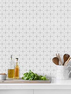
Best Seller Mosaic Tiles
ID# 170402 | Houzz.com – Credit | © Rocco Revolution
Mid-Century Backsplash with Wood Floating Shelves And Cabinets
This U-shaped Mid-Century kitchen is distinguished by wood and a variety of textures in warm tones! The wood cabinets, adorned with white quartz counters, best portray the mid-century feelings. The stacked ceramic tile backsplash at the rear of the floating shelves adds a modest textured effect with a modern flair. The marble slab backsplash behind the stove, on the other hand, adds a sumptuous touch to the whole design.
What is the mid-century kitchen?
A mid-century kitchen embraces openness, pops of colors, and natural materials that keep it connected to nature. That’s why the mid-century kitchen seems like a natural extension of nature rather than imposing something artificial. Open-plan layouts and large windows reinforce this natural connection with the outdoors, which blur the distinction between the inside and out. Employing wood as the main piece most of the time, a mid-century kitchen goes for darker and middle-tone wood. As such, they are more often associated with a sophistication that carries along with a nostalgic vibe with it. But surely, a mid-century kitchen takes cues from Scandinavian designs and includes light shades as they share the same principles. Functionality, pure forms, uncluttered spaces, and efficiency lay the foundation of both styles.
Though the mid-century style stayed loyal to its core principles, it showed some variances over time. For example, the 1950s embraced the primary colors, blue, yellow, and red, to promote optimism. The 1960s, on the other hand, brought more earthy tones and a soil palette to ground the look. So, in the later years, the color spectrum stayed more loyal to the darker shades of green and red. Especially the take-on the wood was taken to the next level.
Apart from those, sleek and clean lines, curvy forms, and biomorphic designs or nature-inspired shapes, potted plants treated as sculptures, and big kitchen islands serve as other defining features of the mid-century kitchens.
As a result, mid-century kitchens have a better understanding of the human body, presenting a versatile character that homeowners can shape as they wish. Just to understand the mid-century kitchen more, now let’s explore how the movement originated and on what premises it built its voice.
What is Mid-century Modern?
Even though the term “midcentury” was only coined in 1984 when journalist Cara Greenberg published the book Mid-Century Modern: Furniture of the 1950s, midcentury was given birth much earlier. Rooted in industrialism with technological advancements and inspired by modernism and Scandinavian style, the midcentury design aimed to propose a counterpoint to the preceding Victorian age’ ornament-focused style. Plus, with the changing conditions in the post-war era, the world needed something different. Something more functional, more future-oriented, and more ergonomic. It was the end of the rigid forms that were heavy, dysfunctional, and not human-friendly.
In other words, after the Second World War, everything had to be reimagined. Harnessing new manufacturing methods and materials gave birth to more clean lines, curved forms, and functionality that came with technological advancements. The emphasis on the function and form and the beauty of both gained a lot more interest. With the curvy forms, the architecture was adapted to the human body and moved beyond the strict lines to bring flexibility. Materials such as wood, plywood, metal, and glass did the speaking while mimicking the anatomy of the human body. The accessibility and scale of the design made everything feel comfy and adjustable to the human body. All those new forms gave birth to a newfound style, midcentury modern.
Overall, this style was geared towards encouraging people to think differently and making them focus on the future to leave the wrecks of the wars in the past.
ID# 170403 | Houzz.com – Credit | © Ironbark Architecture + Design
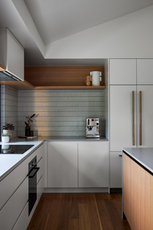
Flat-Panel Cabinet Design with White Stacked Grid Midcentury Modern Style Backsplash
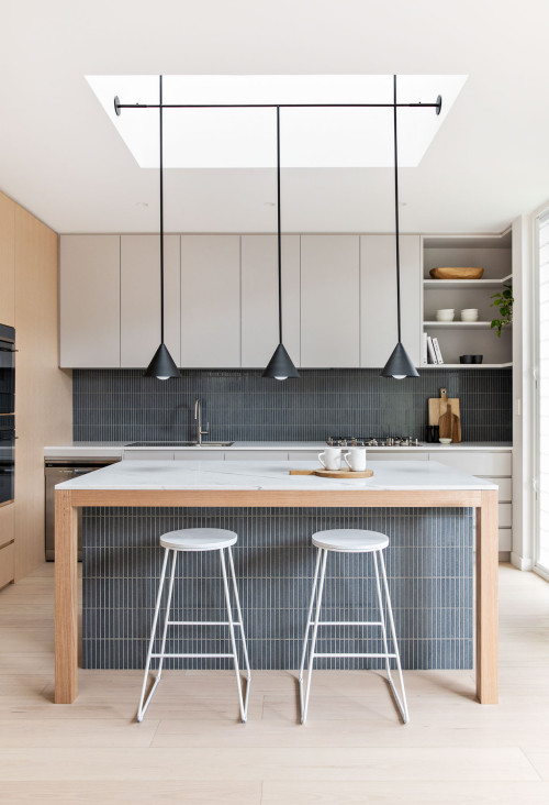
In this mid-century kitchen, the generosity of the design lies in the bright white shades that enhance the openness of the space! To balance the airiness, the wood textures are added to bring the design down to earth. On closer inspection, the gray stacked grid mid-century backsplash with white quartz countertops brings out the warmth of the cabinets. The potted plants distributed here and there add a pop of color to reinforce the design’s connection to nature while the oversized cabinet handles with the same material as the cabinets give a traditional spin to the cabinets without compromising their modern appeal. Lastly, the wood flooring matches the island to bring the space together and the wood floating shelf replacing the upper cabinets fosters visual and physical openness to ease the flow.
Modern Midcentury Kitchen Backsplash
A modern midcentury kitchen backsplash can form a body in hexagons, Escher tiles and stacked subway tiles that bring modern appeal to the space. Likewise, square tile backsplashes achieve a retro look that feels modern in the meantime, exposing its users to modern nostalgia. Natural stones such as quartzite and marble also add sophistication with a modern vibe to them. Picket tile pattern backsplashes or tiles rich in bold hues endow the space with necessary contemporary vibes that ensure the relevance of the design. While doing so, they also remain loyal to the midcentury spirit that favors optimistic colors!
ID# 170404 | Houzz.com – Credit | © Susan Cleveland Design
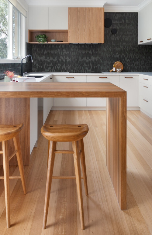
Mid-century Modern Style Kitchen Backsplash with Waterfall Island and White Dark Wood Cabinets
One of the key features of mid-century kitchens is to keep the flow alive with understated decorations and clean lines. The second is to synthesize the man-made and organic materials together. This open-plan kitchen does both with a rich material repertoire and small-scale fixtures that add flow to the space. To exemplify, the handmade fireclay backsplash tiles create a moodier background while the white quartz countertops and white cabinets bring contrast to the backsplash. The stacked layout of the backsplash emphasizes its modern appeal. Additionally, wood occupies a great amount of space, cladding the range hood, floors, and peninsula to encapsulate the open layout with organic vibes.
ID# 170405 | Houzz.com – Credit | © Pink Box Design
Blue Geometrical Tile Backsplash with Open Shelving and White Countertops
Earthy tones and lots of wood serve this mid-century kitchen design very well. Clad in wood cabinets that stretch from wall to wall, the space gains a sense of grandeur, oozing warmth and coziness that steals its users’ hearts. The stainless steel appliances create a modern look and the addition of the open shelving and wooden hardware brings a popular material of the 1940s through 1960s. The exhibited sculpture-like potted plant and other decorative vases channel mid-century vibes skillfully. At the back, the blue geometrical tile backsplash adds textural interest and sophistication while white quartz countertops brighten up the otherwise all-brown and wood kitchen.
ID# 170406 | Houzz.com – Credit | © Making Spaces
Warm Wood Cabinets with Marble Backsplash and Brass Lighting Fixtures
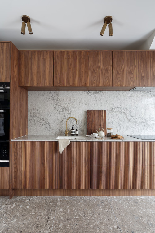
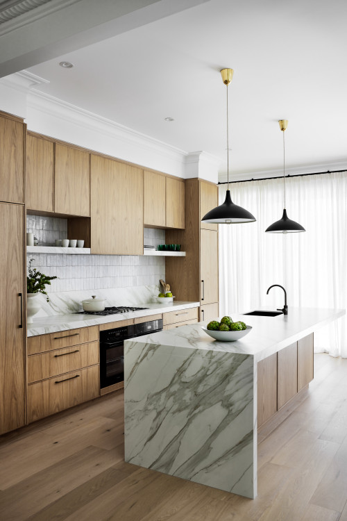
Another mid-century kitchen design with warm wood cabinetry crowned with many other Mid-century-inspired fixtures to bring cohesion to the space! The pattern-rich marble backsplash and countertop are what make a statement, standing out between the medium-tone wood cabinets. To retain integrity, the cabinets feature paneled cabinet doors while the brass lighting fixtures are on the way for a sense of diversity. As our eyes move toward the other side of the kitchen, the wood floating shelves accentuate the wall.
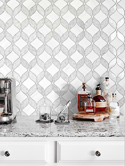
Colorful Mosaic Tiles
ID# 170408 | Houzz.com – Credit | © ABI Interiors
Mid-century Modern Design with Full-Height Marble Slabs
The brightness and warmth of this modern kitchen are welcomed by an eye-catching marble stone. The massive marble slabs used as a backsplash provide a visually appealing backdrop for this room while employing the same texture as the range hood cladding to provide a continuous aesthetic. The basic white kitchen cabinets provide a clean and bright appearance, making the marble slabs stand out even more! The dark wood kitchen island contrasts with the white elements and lends warmth to the space. The brass-detailed globe pendant lights over the island add a mid-century atmosphere while the matte black details add to the futuristic look.
White Midcentury Kitchen Backsplash
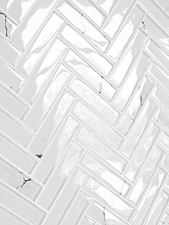
White is one of the favored colors in mid-century kitchens that is combined with warm wood cabinets to illuminate the space and bring some contrast. But the main reason for white to be loved this much is that white helps the flow within the space. Especially when flipped white subway tiles achieve sleek vertical lines, captivating the core image of the midcentury kitchens. Plus, they achieve a more graphic look that also aligns itself with the Art Deco movement.
To complement a white backsplash, wood cabinets, brass sunburst lighting fixtures, globe-shaped pendants, and Sputnik lighting are popular secondary items. Also, to enhance the openness and airiness, you can utilize the wood floating or glass floating shelves supported by brass legs rather than overhead cabinets.
ID# 170409 | Houzz.com – Credit | © GRANT WHITE DESIGN LTD
White Midcentury Kitchen Backsplash with Black Cabinets and Waterfall Island
From the glass-fronted cabinets to the unique wood flooring and stainless steel appliances, this mid-century kitchen presents a firm, cozy, and retro look that takes us back in time. As the black cabinets colonize the space, the gray granite countertops and porcelain subway tile The brass hardware that maintains the uniform look, and the glass fronts of the cabinets add layers of interest for more character. These understated decorations build up an interesting background to look at. The brass detailed lighting fixture, granite countertops, and metallic counter stools serve as complementary elements to nail the mid-century look.
ID# 170410 | Houzz.com – Credit | © March Twice Interiors
Cozy Kitchen Design with White Stacked Midcentury Kitchen Backsplash
This gorgeous and cozy kitchen design features a color palette down to earth, abounding in wood shades. The natural wood base cabinets topped with white countertops and white ceramic stacked subway tile backsplash harmonize beautifully, presenting a heart-fluttering scene. This charming combination feels enriched with white upper cabinets and wood open shelving. Potted plants and decorations put on display on these shelves personalize the kitchen design. The light-colored wood flooring evokes visual interest, which ties the design together along with the wood cabinetry.
What are mid-century cabinets?
Needless to mention, cabinets are the essential features and key to defining the main character of the design. They let you play with the character of the design through the hardware, color, material, and door-style options to build a certain theme. Be it modern, contemporary, transitional, mid-century, or farmhouse, the same logic applies. When it comes to mid-century cabinets, they exhibit a streamlined look with clean and sleek lines to emphasize movement and flow, which makes them extra essential in midcentury kitchens. In other words, they pose as modular silhouettes that ooze horizontally.
Midcentury Cabinet Materials
The midcentury cabinets are generally made of wood and plywood with a more flexible and function-oriented form. Medium and dark wood cabinets, particularly rich-stained cabinets, are quintessential pieces to create a visual drama and radiate midcentury vibes. You can combine them with crispy white backsplashes for a more neutral look. However, to be more adventurous, you can go for geometric-patterned backsplashes that add a ripple of color and make a statement.
In addition to wood, glass was another popular material. For a stylish look, you can aim for reeded glass doors to accentuate the cabinets. In some kitchens, suspended shelving features glass doors to build extra interest and enrich the look.
Midcentury Cabinet Colors
Midcentury cabinet colors range from deep hues of green and red, to slate blue, chocolate brown, turquoise, and orange. When the cabinets come in bold colors, they also generally feature wood hardware as a reference to midcentury modern’s love for wood.
ID# 170411 | Houzz.com – Credit | © Wood Works Brighton
Natural Mid-century Kitchen with Orange and Wood Cabinets
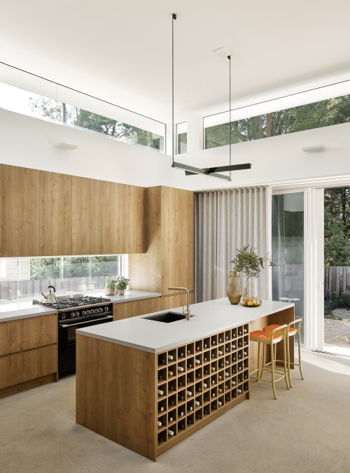
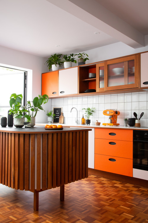
Known for its organic forms, the mid-century kitchen captures a natural spirit while staying true to the material itself, which this kitchen excels at evidently. In this natural design, the garden finds translation in the kitchen through potted plants and timber finishes that create a nature-inspired design. To support this look, a sense of openness and the intimate connection between the kitchen and garden feel evident as the inside and out flow into each other through picture windows and the full-glass door. The incorporation of white square backsplash and white quartz countertops promotes the flow through clean and sleek surfaces they bring. A little further, the orange paints of the cabinets embody the mid-century spirit effortlessly and add a splash of color to the space.
Gray Midcentury Kitchen Backsplash
Celebrated as a versatile and neutral color, the gray backsplash finds a place also in a mid-century kitchen. If you aim for a moody look rather than a colorful and pristine white backsplash, gray gets you that feeling. To build up the impact, you can bring in darker shades and nickel-finish hardware. A concrete kitchen island can serve the space to complement the gray backsplash that will come with an industrial subtext as well. For a variety, a hint of metal and glass enriches the look and brings a retro touch.
ID# 170414 | Houzz.com – Credit | © Blue Tea Kitchens and Bathrooms
Gray Midcentury Kitchen Backsplash with Glass-Fronted Cabinetry
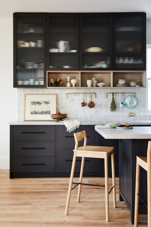
In this midcentury style kitchen remodel, the glass-fronted black upper cabinetry offers a nice textural look while the backsplash tiles make the statement. Featuring a fresh palette of white, gray and black, these saturated colors mingle with wood textures, feeling visually enriched. White countertops build a layer of joyfulness that gains sophistication with a gray backsplash. The subtle tonal variations of the square tile backsplash exhibit a cinematographic mode to elevate the design. The light wood open shelves and brass accents embellish the space without cluttering and compromising the flow.
ID# 170415 | Houzz.com – Credit | © Jumble & Stack
White Kitchen Design with Gray Fish Scale Tile Backsplash
If you want to make your backsplash a main point, leaving the rest white is a great way to do so! For example, in this midcentury modern kitchen, the gray mermaid tile backsplash sticks out among the clean white elements to create a wow effect. The black grout highlights this one-of-a-kind design, while the black cabinet hardware and pendant lighting over the peninsula add to the modern look.
Unique Mosaic Tiles
ID# 170416 | Houzz.com – Credit | © Ethos Interiors
Eat-in Modern Kitchen Design with a Large Island
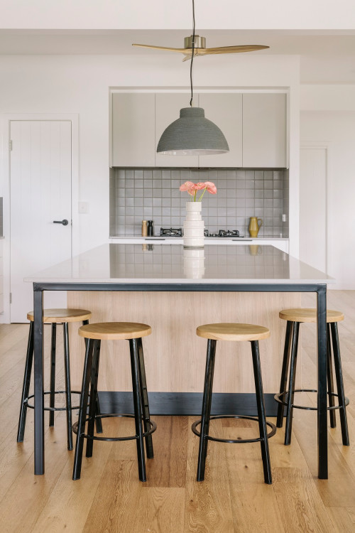
Enriched by plenty of bar stools, this large kitchen island is the star of this modern design! The wooden bar stools with black legs bring an industrial vibe to the room while the white quartz countertop creates a continuous look with the background. At the back, the gray square tile backsplash frames the gas cooktop while the black accents provide contrast to the white walls and timber floors.
Colorful Midcentury Kitchen Backsplash
Mid-century kitchen backsplashes embrace striking colors to create a statement. They are rich in oranges, blues, yellows, and golden highlights. They enhance not only the user experience in the kitchen but also the optimism that color brings. White cabinets with wood hardware or cabinets made of wood are frequently used to accent these vibrant kitchen backsplashes. Checkerboard flooring and appliances in vintage-style colors can give additional character to the design and add more pattern and excitement.
ID# 170418 | Houzz.com – Credit | © Residential Attitudes
Hexagon Midcentury Kitchen Backsplash with White and Wood Cabinets
This mid-century kitchen design has a little bit of everything. Bold colors, wood, potted plants and hexagon backsplash stand out as the main features that develop the narrative of the space. The hexagon backsplash brings a 3-dimensional impact to define the background in the company of a window backsplash that captures a snapshot of the garden. The blocked island feels like the summary of the mid-century look. It is functional, improving the utility of the kitchen; it is richly stained wood that refers to nature. The two-tone cabinets and globe-shaped pendants referencing the space ambitions of the Cold War era and ergonomic-design curved counter stools present various aspects of the mid-century design!
What backsplash is suitable for midcentury kitchens?
The mid-century kitchens love geometric patterns that bring aesthetic values, and the best way to integrate such geometric patterns is via a kitchen backsplash. Hexagon, Escher, fish scale pattern, and horizontally and vertically stacked subway tiles are the most popular options.
As for the color patterns, the Escher patterns are suitable to build a more colorful background. And if you want to capture the gist of the movement, orange, yellow, burnt orange, and blue channel mid-century vibes masterfully. Of course, you can also use other bold colors and saturated hues to pull off that ambitious look you aim for. But, if you go for a neutral look, you can consider gray and white ceramic and porcelain tiles.
How do you complement cabinets and backsplash to pull off a perfect mid-century look?
Going back to that era when the Pop Art Movement and Abstract Expressionism made a name for themselves, it is no surprise to see abstract and graphic prints hung on the walls to make a statement. Geometric-shaped sconces and Sputnik, bulbs, and globe-shaped, and starburst lighting fixtures are heavily used. Such pieces were especially essential due to their reflective nature of the era, taking their cues from the ongoing Cold War between Russia and the USA. The USA’s messages on scientific discoveries and its premise of prosperity were the main subtexts of such designs.
Aside from those, potted plants, sculptures, and stylish floating shelves are other decorative items to build more character. Likewise, running-style rugs with geometric patterns, bold colors, and oriental features serve as complementary pieces. Lastly, if you would like to integrate an eating space, you can go with a round table made of metal and wood that is reflective of the mid-century spirit.
ID# 170420 | Houzz.com – Credit | © Laminex Australia
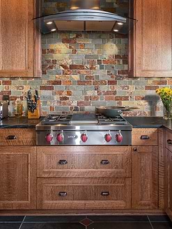
Rustic Midcentury Kitchen with Slate Backsplash Tiles
Blending the rustic and midcentury aesthetic, this cozy kitchen offers a warm and welcoming atmosphere! The slate mosaic tile backsplash creates a visually pleasing art like appeal while the natural wood kitchen cabinets perfectly complement the rustic allure of the slate tiles. Using larger tiles behind the stove is a great way to balance the busy pattern and add more visual interest. For a final touch, the beige granite countertops perfectly complete the overall look with a cohesive appeal!
ID# 170421 | Houzz.com – Credit | © bellager design
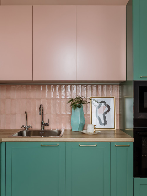
Pink Midcentury Kitchen Backsplash with Two-Tone Cabinets
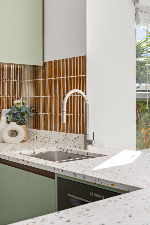
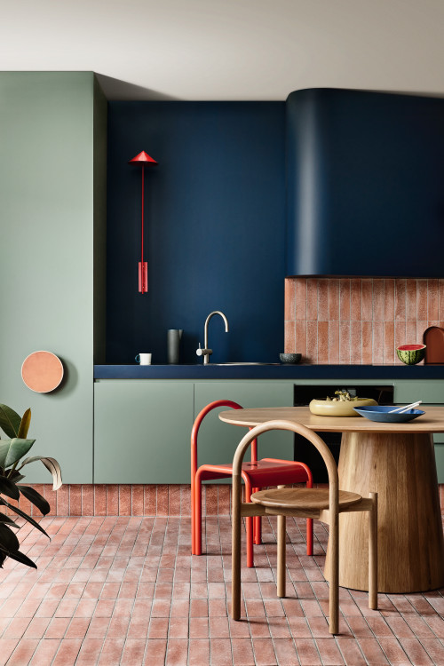
If you’re seeking complementary hues, pink and green are two of them. As shown in this Midcentury kitchen, the green, wood and pink work together to create a sophisticated design. The pink handmade backsplash tiles match the upper cabinets and offer a great textured touch. The wood countertop contributes to the natural feel of the green while the brass hardware provides a touch of glitz.
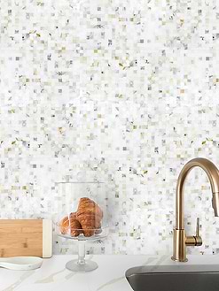
White Mosaic Tiles
Midcentury Kitchen Backsplash with Wood Cabinets
Ranging from bamboo-clad kitchen islands to walnut counters and plywood cabinets, midcentury kitchens draw their cues from nature and always declare a character down to the earth. That’s why the engagement with wood cabinets during the 1940s and 1960s was taken to the next level. The wood flat-front and recessed panel cabinets gained extreme popularity used as the main bones of the kitchen.
But how do you soften this solid wood look? The crispy white and off-white backsplashes generally top the counters. Or geometric patterned colorful backsplashes inject generous amounts of color to reinforce the vintage vibes. Also, wood-clad ceilings and floors along with the butcher block countertops are from time to time brought in to bring the space together.
ID# 170424 | Houzz.com – Credit |© Hearth Built Pty Ltd.
Kit Kat Midcentury Kitchen Backsplash with Wood Cabinets and Brass Accents
In this natural kitchen design, modern meets mid-century pieces as they unfold as a mélange of various materials, including a white Kit Kat backsplash, wood cabinets, and a white island. The natural lights find a home for themselves to dive into the kitchen through the window, and the decorative items on the open shelves create an accent wall. At the rear, the floor-to-ceiling wood cabinets rest themselves while in the front, the white island with a white quartz countertop lets the interplay of light. Matte black lighting fixtures and chairs enhance the modern aesthetic while the stainless steel appliances introduce glow and shine to soften the all-wood look.


