30+ Backsplash without Upper Cabinets
ID# 138003 | Houzz.com – Credit | © Scale Constructions
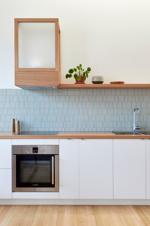
Blue Kit Kat Mosaic Tile Backsplash with Wood Countertops and White Cabinets
Even if you keep the upper walls free, you can still hide your range hood in a cabinet like in this particular kitchen. Here, this modern kitchen uses frosted glass for the cabinet to evoke extra interest. Right below, the blue kit-kat blue tiles add a sophisticated feel, bringing a subtle shade of color. And it is skillfully flanked by a timber floating shelf and timber countertops, while the white flat-front cabinets blend with the white walls harmoniously.
ID# 138017 | Houzz.com – Credit | © studio mkn
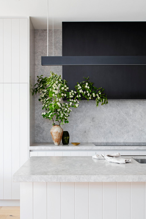
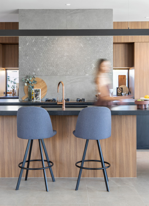
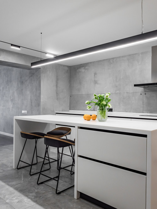
Gray Marble Backsplash with White Beadboard Cabinets and Black Linear Lighting Fixture
In open-plan kitchens like this one, using full-height cabinets not only helps zone the kitchen but also increases the storage area to compensate for the lack of upper cabinetry. But if that doesn’t feel enough, the employment of a kitchen island serves as another strategic decision to create a better sense of space while offering extra storage. This way, the open-plan kitchen gains a better definition and more storage. Plus, forgoing upper cabinetry allows exposing the ceiling-height marble backsplash fully as here, while the rest of the space feels complete with a black linear lighting fixture, black stools, and beaded-board cabinets for extra interest.
Backsplash without Upper Cabinets
Recently we have started to see designs with a backsplash without upper cabinets more and more, which in turn, comes with a plethora of benefits. To name a few, a backsplash without upper cabinets means more open space, enhanced brightness, and more room for wall decorations and windows. What is more, by incorporating picture windows that are minimalist in character, you can invite sky and garden views indoors, which blurs the difference between the interior and exterior spaces. Plus, as the pandemic has already proved, our homes need extra brightness, spaciousness, and connection with the outdoors. And one way to accomplish this is to ditch overhead cabinets.
Though, a backsplash without upper cabinets comes with one disadvantage, leaving more stuff that needs to be stored and kept out of sight. But even it has a good part by requiring us to be more creative with storage solutions. Yet above all, whether you decide to go with a floating shelf, drawer cabinets, an island for extra storage, or a freestanding open closet, multiple solutions can compensate for the lack of upper cabinets. So, don’t despair and just let your imagination do its job and walls be caressed by tiled and slab backsplashes available in limitless design options. Here we have compiled a list of backsplashes without upper cabinets to get you inspired and more familiar with this on-trend look.
ID# 138001 | Houzz.com – Credit | © AMA Studio Interiors
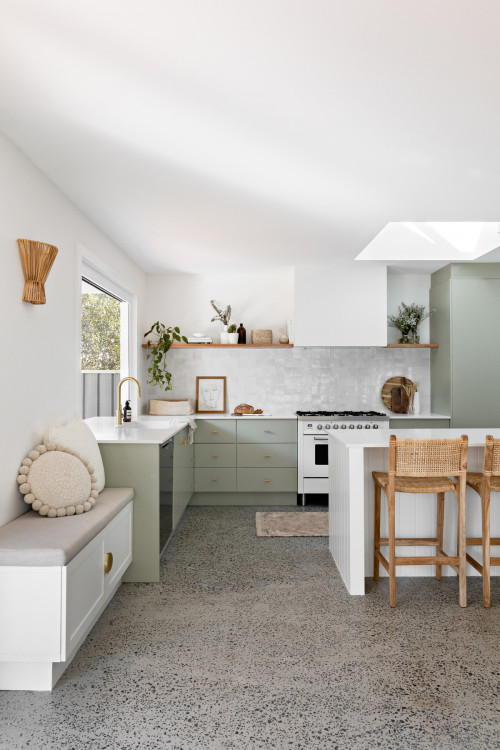
Modern Kitchen with Green Cabinets and Backsplash without Upper Cabinets
Eyeing the garden through the picture window, this modern kitchen reflects its local context on the kitchen design with a basic palette of natural shade and muted green cabinets. To make more room on the walls for a floating shelf and kitchen plants, it forgoes upper cabinetry. These organic forms and shades find a contrast with the speckled concrete floor. The constantly shifting sunlight diving into the kitchen through the skylight allows the interplay of shadows and lights. A banquette, beadboard kitchen island, and rattan stools complement the overall scheme.
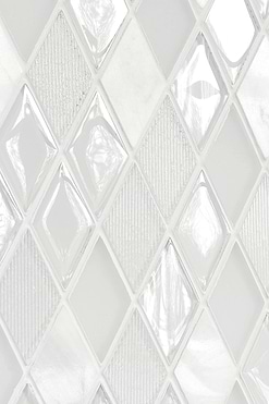
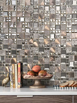
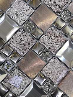
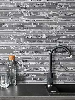
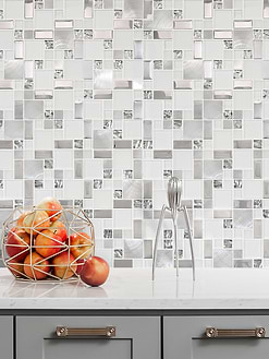
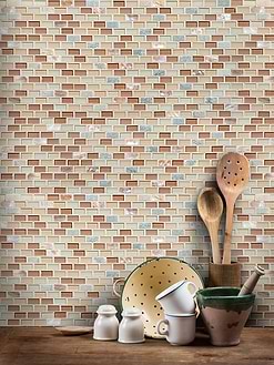
Glass Mosaic Tiles
ID# 138002 | Houzz.com – Credit | © EKOSS
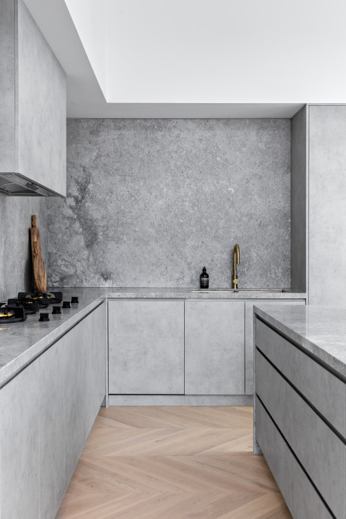
Concrete Kitchen with Chevron Floor and Concrete Cabinets
If the whole kitchen design is carved out of the same material, how would it look? Here, we have a kitchen that is clad in concrete except for the chevron wood floor that breaks up the monochromatic scheme. Bringing a modern and industrial edge to this kitchen, concrete cabinets paired with concrete countertops and gray marble backsplash act as a single body. The upper walls free of wall units keep the space open and breathing, while the use of one form and color makes for a sophisticated look. Plus, while you have such a statement material that is easy to maintain and characterful, why not make use of it to the fullest?
How high should the backsplash be without upper cabinets?
There is no rule of thumb regarding the height of the backsplash. Hence, it rather boils down to personal preferences. You can either keep the backsplash at its standard size, which is 4-inch, run it shorter on the wall, or take it up to the ceiling. In each scenario, it works well. Of course, this decision is also shaped by the other design elements taking part in the existent narrative of the kitchen. The size of the available kitchen space could also serve as an impacting factor on the size of the backsplash. In short, just because you won’t have any upper cabinets won’t define or determine how high the backsplash should reach.
ID# 138004 | Houzz.com – Credit | © ABI Interiors
Contemporary Kitchen with Gray Backsplash without Upper Cabinets
Embodying an ultimate form of high craftsmanship, this contemporary kitchen showcases what you can create out of an open-plan layout. And what it presents is a kitchen centered in a non-restrained spot devoid of walls, which necessitates an upper cabinet free-design. As such, the resulting scheme only consists of base cabinets and a backsplash that reaches the ceiling for extra support and serves as a feature wall. The overall look gets determined by the wooden cabinets, concrete-finish quartz backsplash, and countertops that keep everything at basics while forming a sophisticated simplicity.
ID# 138005 | Houzz.com – Credit | © Roundhouse
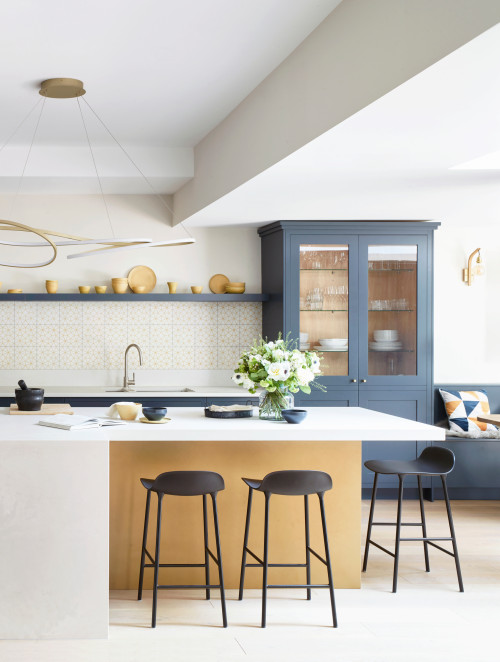
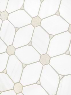
Colorful Kitchen with Island and Star-pattern Tile Backsplash
This kitchen is designed for a family who loves cooking and uses the kitchen as a social hub, which explains the placement of the island, energizing color scheme, and the banquette. Serving the same aim, the hob and the main sink find themselves integrated into the perimeter counters to expand the availability of the island benchtop. The hand-painted gold paneling of the island base takes its reference from the lighting fixture and yellow star-shaped details on the tile backsplash that creates a morning sky. The lighting fixture reminiscent of the carousal that we come across in entertainment parks adds an eccentric detail overhead, creating a satisfying design for homeowners.
What can I use instead of upper cabinets?
Floating shelves are an excellent substitute for upper cabinets. They not only accentuate the walls but also help personalize the kitchen. This way, you can make your kitchen truly feel your own. If you are looking for a sense of change, you can also use kitchen islands, freestanding cabinets, pegboards, ceiling-mounted cast-iron pot racks, and bar carts instead of upper cabinets. In other words, the lack of upper cabinetry means more space for imagination, thus feel free to come up with your storage solutions for a more unique design.
Backsplash Height for Kitchen without Upper Cabinets
The minimum splash-back height measures 450 mm from the countertop, but if you are installing it behind the stove, it should go higher to provide full and impeccable protection for your walls. And when you don’t use upper cabinets, you can go with any size backsplash, which depends on your personal preference. Generally, the backsplashes are kept at a standard size, only going 4-inch up from the countertop. It also costs less than cladding the whole wall until the ceiling. But if you love tiled or slab backsplashes rather than bare walls and are not on a tight budget, you can use ceiling-height backsplashes for a more dramatic effect.
Standard Backsplash without Upper Cabinets
Standard backsplashes only extend 4-inch above, starting from the countertops, which leaves the top half of the kitchen bare. This way, kitchens have more breathing space and feel opened up, having more room to be personalized. Whether it could be floating shelves, wall sconces, paintings, or other decorative pieces, these walls can be decorated with practical and eccentric objects. If you love shabby chic, bohemian, and modern Tuscan kitchens, you can keep the top part of the kitchen as empty as possible to leave more space to personalize the walls and the kitchen. It is one of the best ways to showcase that the kitchen is just your personal space, which will keep motivating you for kitchen work.
ID# 138007 | Houzz.com – Credit | © Holman Designs
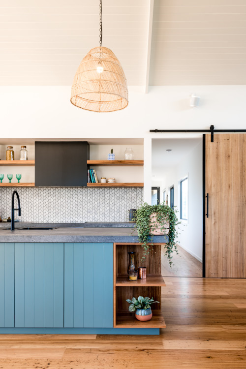
Leaf-Shaped Blue Tile Backsplash with Blue Cabinets and Open Shelves
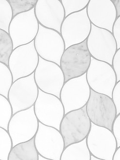
The combination of blue shades with wood textures never fails, and this contemporary kitchen is no exception. Consisting of blue beadboard cabinets paired with dark blue solid stone countertops and leaf-shaped tile backsplash, it prioritizes the openness of the space. That’s why it is treated in such a way as to keep consistency between the vastness of the kitchen and the unoccupied kitchen walls. To achieve that, the timber floating shelves got installed, replacing the wall units except for the one that conceals the range hood.
ID# 138008 | Houzz.com – Credit | © Dall Designer Homes
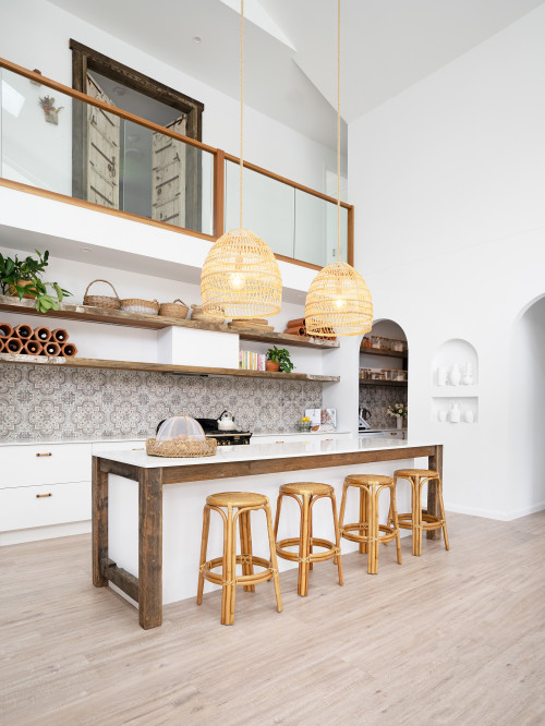
Mediterranean-inspired Kitchen with Encaustic Tile Backsplash without Upper Cabinets
This Mediterranean-inspired coastal kitchen has a mesmerizing edge to it. Whether it is the pristine white of the walls, arched cased openings, niches, open timber shelves, or perhaps all of them, it all feels impactful, interlocking like puzzle pieces in this double-height volume of the kitchen. In the background, the printed encaustic tiles with subtle shades of brown clad the 4-inch of walls, letting timber shelves acknowledge the upper half as their place. Right across, the oversized boho pendants add an eccentric vibe above the white kitchen island punctuated by reclaimed wood beams on the edges.
How can I organize my kitchen without upper cabinets?
Unlike traditional kitchens that tended to hide everything from view, modern kitchens prefer free and breathing designs even if it comes at the cost of sacrificing upper cabinets. And to compensate for the lack of extra storage provided by wall units, there are plenty of ways. One of them is floating or cantilevered shelves that can store plates, rugs, and other decorative features. The big ones and stainless-steel versions can hold up heavy weights, ensuring the longevity of the design.
Another alternative consists of wall-hung rails or ceiling-mounted pot racks over the islands. You can hang your pots and other utensils and expose them completely to allow easy grab and keep them more accessible. Apart from those, available in multiple shades, pegboards offer another substitute where you can hang a wide range of kitchen utensils to personalize your kitchen.
However, if you want to keep your upper walls empty, you can find better ways for storage. For example, adding slide-out drawers and cabinets divided into drawers could be one way to do it.
Kitchen islands could also function to provide extra storage. If you have a vast space, you can even use double islands that will give you more storage. Or you can dedicate one of your walls to the full-height cabinets to optimize storage. Buffet tables, sideboards, and bar carts could also be some eccentric and eye-catching additions to enrich the kitchen’s furniture repertoire.
ID# 138009 | Houzz.com – Credit | © Brownlow Interior Design
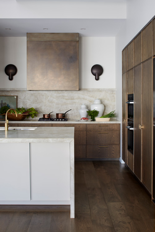
Natural Design Kitchen with Wooden Cabinets and Beige Backsplash
Awash with earthy shades, this natural kitchen design is characterized by medium-tone wooden cabinets, a solid stone backsplash, and an oxidized zinc hood. The beige undulating forms on the white base of the quartz backsplash and matching countertops introduce fluid forms in full contrast to the dominant rectilinear forms. And to spice up the wood shades, the brass cabinet handles with a brass tap bring in sparkle.
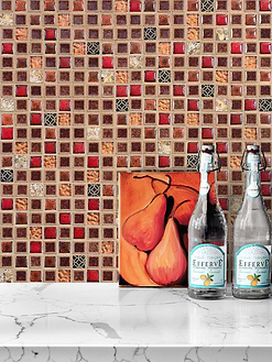
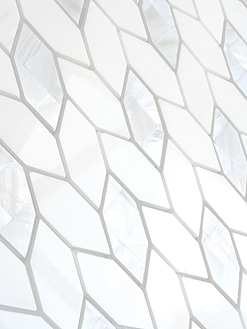
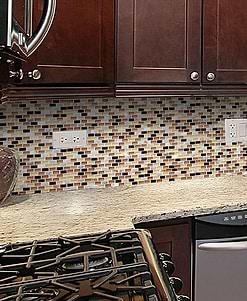
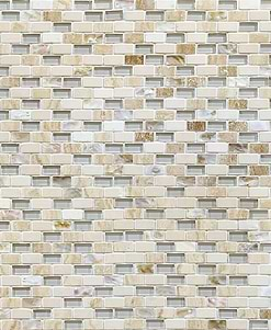
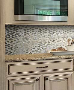
Shell Mosaic Tiles
ID# 138010 | Houzz.com – Credit | © Eliza Blair Architecture
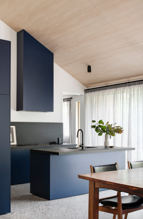
Blue Cabinets with Black Backsplash and Countertops
This sleek kitchen theme delves into the dark side of the design world, bringing dark blue cabinets, a black backsplash, and black countertops together. The clean lines of the flat-front cabinets ensure everything feels smooth and continuous with each other even if they differ in shades and materials. The custom design range hood adjusts itself to the shape of the gabled ceiling, emphasizing the grandness of this kitchen. This way, the kitchen feels even more elevated thanks to the dramatic color scheme.
Full-Height Backsplash without Upper Cabinets
When you don’t have upper cabinets, it means that you have more place for your backsplash. And today’s market presents you with an immense repertoire of backsplash colors, materials, and size formats, ranging from encaustic tiles to ceramic, porcelain, and solid stone tile and slab backsplashes. Thus, whether you love metals, tiled, or solid stone, you have multiple options to choose from.
ID# 138012 | Houzz.com – Credit | © Bryant Alsop Architects
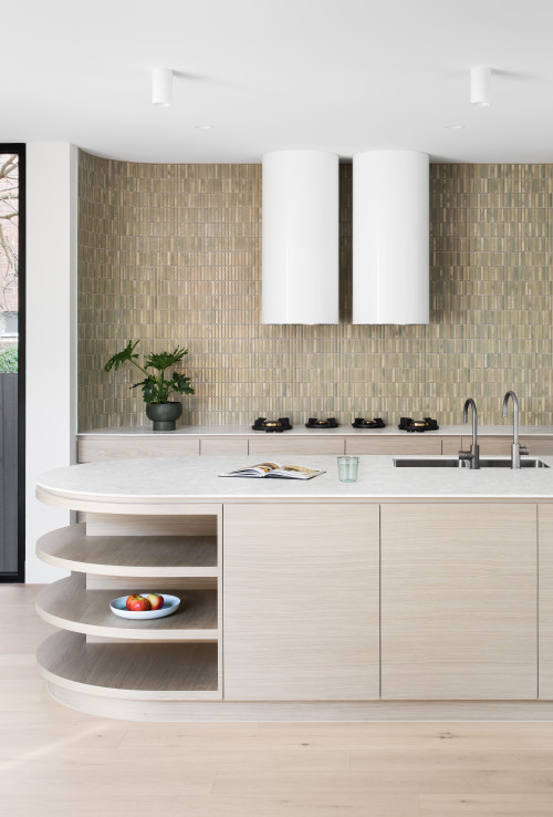
Full-Height Backsplash without Upper Cabinets and Upscale Appliances
Dominated by earthy shades, this contemporary kitchen in Melbourne offers comforting aesthetics, luring its users for longer stays. The upscale white cylinder hoods double in quantity, punctuating the kit kat mosaic tile backsplash that traverses the whole wall. The light timber cabinets topped by thin white countertops instill calmness, while the rounded kitchen island exhibits soft aesthetics and creates a user-friendly working space.
ID# 138013 | Houzz.com – Credit | © Toscano Constructions
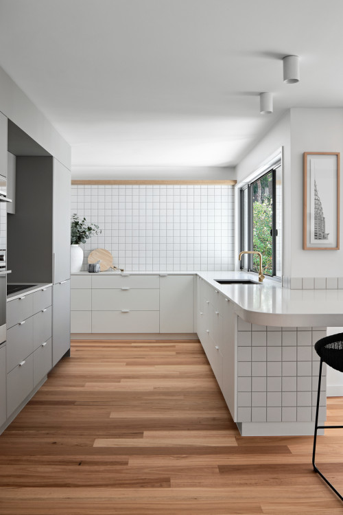
Monochromatic Kitchen with Wood Accents and Square Tile Backsplash
This achromatic kitchen is grounded on white cabinets topped by white countertops and a ceiling-height square tile backsplash. Overall, it presents a neat and clean look softened with wood accents integrated here and there for a sense of warmth. But what makes this kitchen stand apart from its counterparts is the way it makes use of square tiles that continue on the lower wall to zone the breakfast bar. And the picture window invites stunning views of the greeneries lying outside, bringing color and nature indoors.
Does a kitchen have to have upper cabinets?
A kitchen can function well enough and feel self-sufficient without upper cabinets. And you can easily compensate for them while just employing floating shelves and getting freestanding open storage and a kitchen island.
Considering their visual impact on the space, the upper cabinets mostly feel extra and bulky overhead. Nowadays people seek open spaces and brightness. Thus, long gone are those days when upper cabinets used to be considered a must or a necessity.
ID# 138014 | Houzz.com – Credit | © Stelly Selway Ltd
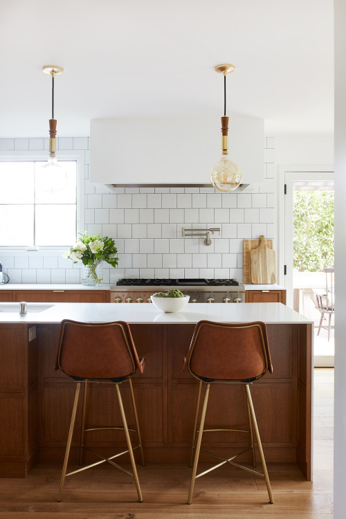
Subway Square Tile Backsplash with Wooden Cabinets and White Range Hood
This super-stylish kitchen goes with a subway square tile backsplash that adds a modern and graphic look to the background. It goes up to the ceiling, ditching the upper cabinetry to enlarge the kitchen. Not to cause any visual break, even the range hood fixture is kept white to blend with the white tiles and white countertops harmoniously. As for the cabinets, they come in the form of wood and drawers, improving the storage and organization capacity of the cabinets. This way, the lack of wall units gets easily handled without causing any clutter on the countertops.
Backsplash Materials
Backsplash materials are various, be it ceramic, cement, glass, solid stone (marble, granite, etc.), mosaic, or quartz. This limitless material vocabulary gives homeowners and designers the freedom to choose according to their budget, the overall design theme of the kitchen, and personal taste.
Marble Backsplash without Upper Cabinets
If you have the top half of the kitchen free, one of the best backsplash materials to go with is a marble. It is sophisticated, elegant, and seamless. Plus, the lack of upper cabinets allows space to open up for the marble backsplash and lets it be the true visual focal point.
ID# 138015 | Houzz.com – Credit | © Studio Gestalt
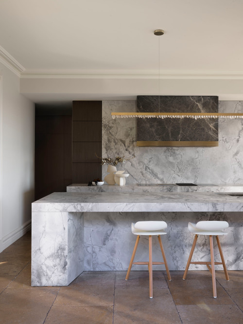
All-Marble Kitchen with Marble Backsplash without Upper Cabinets
This upscale kitchen design owes its stunning look to the statement material marble. Coming in shades of gray with pronounced veins, the marble creates a dramatic look that feels sophisticated and approachable at the same time. The outstanding island carved out of marble, countertops, and backsplash presents a uniform look. It is enriched by a brass lighting fixture, brass trim of a black marble hood, and stone floor tiles that come in earthy shades.
ID# 138016 | Houzz.com – Credit | © The Renovation Broker
Modern Kitchen with White Cabinets and Standard Size Backsplash
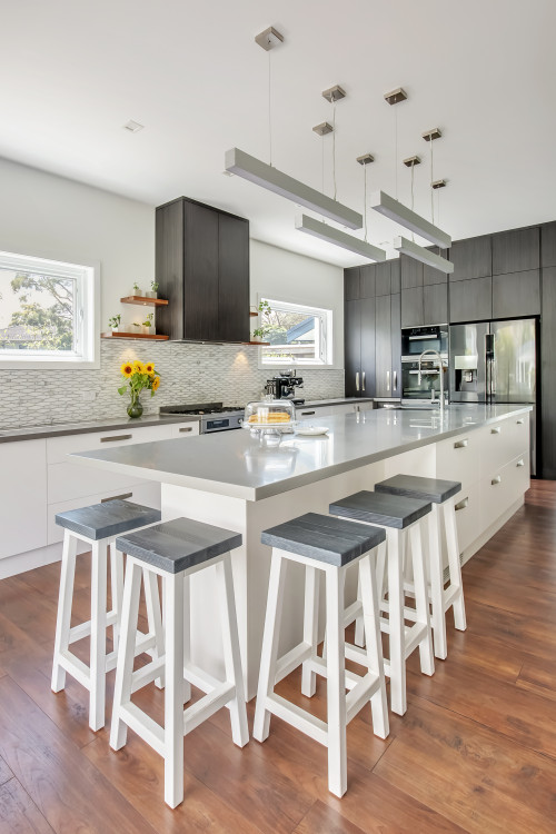
Though directly opening onto a terrace and a well-tended garden, this modern kitchen resists this outdoor space with a cool color palette of grays and whites. Mainly defined by white cabinets, gray quartz countertops, and a standard-size marble backsplash, it features a resilient theme. And it is only the timber floating shelves that sandwich the range hood fixture, miniature plants, and picture windows with tree views that introduce outdoor life. In the center, the oversized island running parallel to the perimeter counters creates a social hub of sorts to increase the utility of the space.
Ceramic Backsplash without Upper Cabinets
Available at affordable prices and with various patterns, colors, and design options, ceramic backsplashes offer almost endless design possibilities. While getting rid of the upper cabinetry, you can reserve more space for these variously sized and designed ceramic tiles. With a gloss finish on the tiles, you can evoke extra interest.
ID# 138019 | Houzz.com – Credit | © ABI Interiors
White Ceramic Backsplash without Upper Cabinets and Wood Fixtures
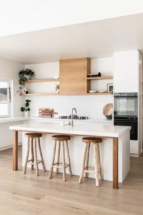
This beach-style kitchen has a very sleek profile that is founded upon clean line cabinetry and timber floating shelves that replace the upper cabinets. Letting go of the wall units exposes the white walls that harmoniously blend with the white backsplash and white cabinets for more breathing space. The white ceramic square tile backsplash laid in a running-bond style generates movement on the walls, while wood accents, built-in appliances, and reclaimed wood stools complement the overall design scheme.
ID# 138020 | Houzz.com – Credit | © Demardi
Scandinavian Kitchen with Two-tone Cabinets and Black Accents
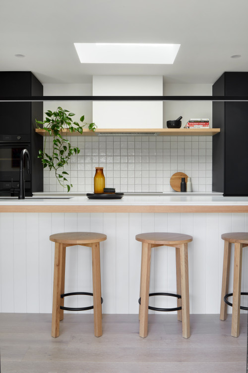
This kitchen realizes all the promises of a Scandinavian kitchen, which requires a natural color palette, functional design, and optimized use of sunlight. Here, the skylight fills the kitchen lightened up, whose effect is enhanced by white cabinets and a white square tile backsplash that presents a clean look. The white kitchen island with a beadboard cabinet base and a hefty white countertop work as a space-organizing utility object. The black cabinets and black tap with other accents give the kitchen a solid look, anchoring the white elements.
ID# 138021 | Houzz.com – Credit | © Studio Lifestyling
Light Kitchen Design with Full-Height Backsplash And White Cabinets
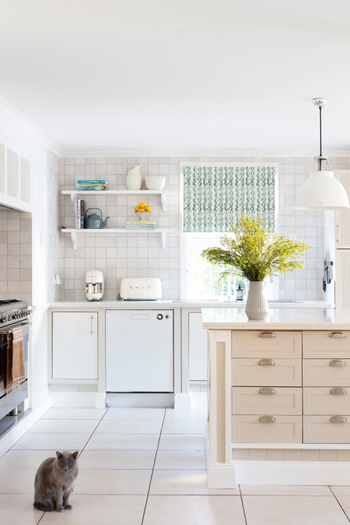
This visually lightweight kitchen design offers a simple and open space, feeling relaxed. The full-height ceramic backsplash consisting of white square tiles creates a uniform look, accentuated by white floating shelves for extra dimension. A kitchen island placed in the center in creamy shades adds a subtle shade of color and warmth while enabling better organization thanks to its multiple drawers.
How can I make my kitchen look taller?
You can easily make your kitchen look taller with a few magical design tricks. One of them is to forgo upper cabinetry, which almost always serves as a space-enhancing factor, exposing the bare walls and making them look taller.
Secondly, you can use full-height solid stone and vertically stacked tile backsplashes to encourage the kitchen to feel taller. Large format patterned encaustic tiles, mirror backsplashes, glazed tile splash-backs, and glass backsplashes also expand the kitchen visually. Additionally, you can go with slim cabinets, clean-line cabinetry, integrated appliances, cabinet lighting, and most importantly a light color palette.
Apart from those, if you have a gabled ceiling or a double-height volume and want to emphasize it, a range hood reaching the ceiling and oversized pendants dropped down can be used to highlight the tallness of the kitchen.
ID# 138022 | Houzz.com – Credit | © Jasmine McClelland Design
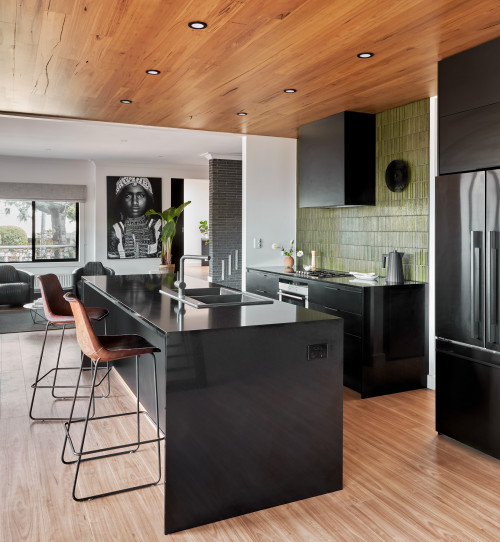
Black Cabinets with Green Kit Kat Backsplash without Upper Cabinets
This sleek contemporary kitchen is designed for a large family, which explains the need for various seating spots and an open-plan layout for a more interactive living space. Even though designing for large families could be tricky to find a middle way for everybody, this design handles it skillfully with a color palette that feels timeless and comforting enough to suit everyone’s taste. This bold scheme is mainly grounded on the black cabinets and ceiling-height green backsplash. The kit kat mosaic tiles treated with a gloss finish add a natural color, pairing perfectly with the wood-clad ceiling and floors. The built-in spotlights on the ceiling ensure lights diffused throughout the space evenly without causing any clutter overhead. The two-compartment drop-in sink brings another efficient element, while the black breakfast bar serves as a laid-back eating space and allows family members to gather in small groups around the island.
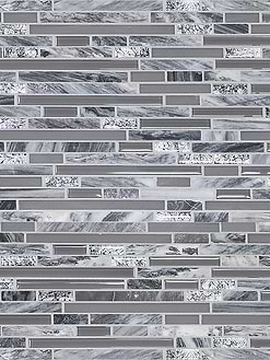
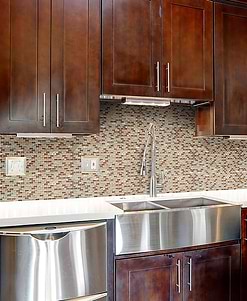
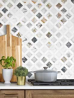
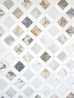
Marble Mosaic Tiles
ID# 138023 | Houzz.com – Credit | © Boffe Design
Colorful Kitchen Design with Pink and Yellow Cabinets and Tile Floating Shelf
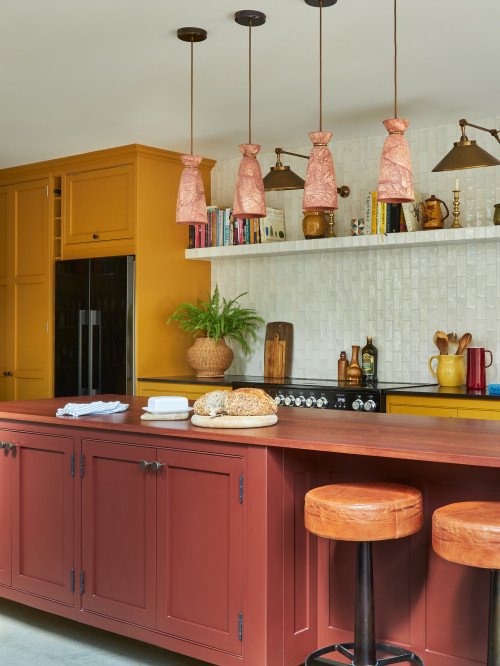
This transitional kitchen in a London apartment is adventurous in its color choices. It starts by pairing the mustard yellow cabinets with black countertops that make for a masculine look. But then it gives it a feminine touch with reddish pink island cabinets that orchestrate a new outfit for this kitchen, creating a unisex design. Yet, its surprises don’t even end there. The white ceramic subway tile vertically laid in running-bond style presents a rare-to-see backsplash tile layout, not to mention the cantilevered shelf made of the same tiles for an eccentric look. The glazed finish on these tiles also brings a layer of glow to the otherwise all-matte kitchen. The antique brass wall sconces, cookbooks, personal accessories, and intriguing pink pendants complement the overall look, creating a memorable design.
Glass Backsplash without Upper Cabinets
If you don’t want your backsplash to be extremely visible but rather provide a barely-there existence, you can choose glass as your backsplash material. Since they come in sheet and tile versions and even non-colored options, you can just use them to add a glow to the walls and a layer of protection against food spills and water splashes. As they are easy to clean, pore-free, and non-demanding materials, you can confidently utilize them in your kitchens.
ID# 138024 | Houzz.com – Credit | © Monita Cheung Design Ltd
Monochromatic Kitchen with Glass Backsplash without Upper Cabinets
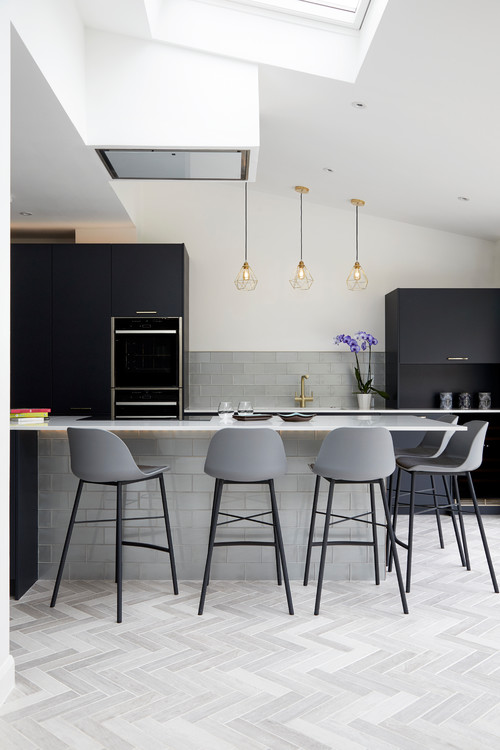
Grey glass subway tiles, used as a backsplash and to clad the island base, create a continuous look in this monochromatic kitchen. The black full-height and mid-size cabinets offer enough storage. Thus, the lack of wall units is easily tolerated, which also makes room for a trio of brass wire pendants that pair perfectly with the brass tap. Right across, the kitchen island houses a hob, above which the range hood is concealed skillfully. The gray herringbone floor tiles and upholstered gray counter stools maintain their loyalty to the monochromatic color scheme.
ID# 138025 | Houzz.com – Credit | © Kutenkovs project
Gorgeous Kitchen Design with Round Mirror Backsplash and Faux Velvet Effect Walls
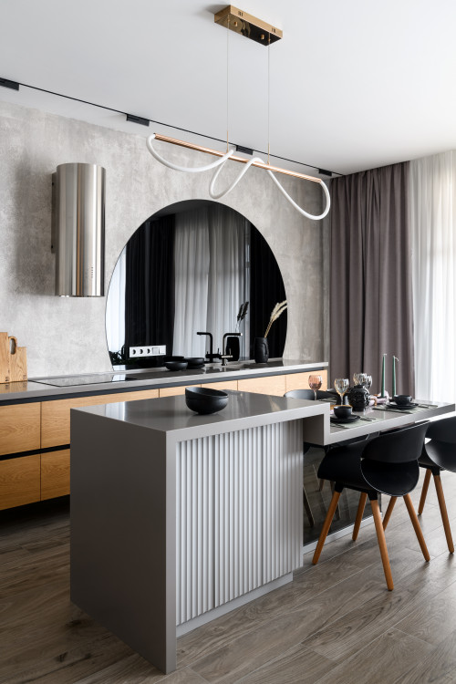
With the stainless-steel cylinder range hood and the round mirror kitchen backsplash, this gorgeous contemporary kitchen design in Novosibirsk offers a one-of-a-kind look. Though the mirror gives the illusion of a powder room, the kitchen island with informal dining space sets it back in a kitchen setting. The faux velvet effect textured walls, thanks to the concrete-look wallpaper design, with long curtains bring an upscale edge to the kitchen. The adjacent wall allocated to the full-height cabinets maximizes the use of storage to maintain a clutter-free look.
ID# 138026 | Houzz.com – Credit | © Юлия Вишнякова
Glass Sheet Backsplash with Two-tone Cabinetry and Gray Solid Stone Countertops
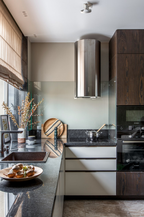
This compact kitchen features a mélange of earthy shades and grays, going with a glass sheet backsplash behind the stove. Without overwhelming the walls, it benefits from a sleek touch that comes with the seamless glass. The rest features gray speckled-finish quartz countertops, stained dark wood, full-height cabinets, and white counters to create a well-balanced look.
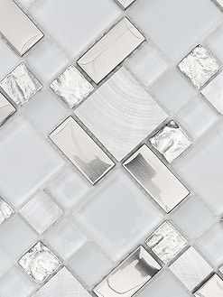
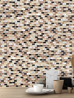
Porcelain Mosaic Tiles
ID# 138027 | Houzz.com – Credit | © Yulia Starikova
Contemporary Kitchen with Concrete Look Backsplash and Floor Tiles
This contemporary kitchen comes with an industrial edge to it with concrete tiles used on the walls and floors for the sake of a cohesive design. The white flat-front cabinets with fluorescent lights complement the tiles, while the full-height wood cabinets on the other side of the kitchen channel warmth, giving the space a healthier look.
Metal Backsplash without Upper Cabinets
One of the on-trend looks of 2022, metal backsplashes, including zinc, copper, brass, and stainless steel come with plenty of functional and aesthetic benefits. Available in multiple patterns thanks to the advanced technology, they introduce undulating forms, eccentric geometric patterns, and easy-to-clean anti-bacterial surfaces. For the same reason, they exhibit a look that you would like to keep as a focal point. And to do that, it would also be better to keep the top half of the kitchen free of upper cabinets.
ID# 138029 | Houzz.com – Credit | © Projective studio
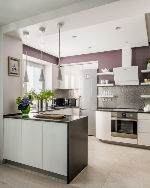
Open-Plan Kitchen with Patterned Metal Backsplash And Gray Countertops
Nestled in a small corner, feeling a little bit reserved, this open-plan modern kitchen in a Moscow apartment lets go of the upper cabinetry to highlight the patterned steel backsplash accompanied by a trio of white floating shelves on both sides. This symmetrical placement provides comfort for the eyes, balancing the shiny surface of the backsplash. Also, the rest of the design features white cabinets and gray quartz countertops, befriended by purple-painted walls to add extra color.
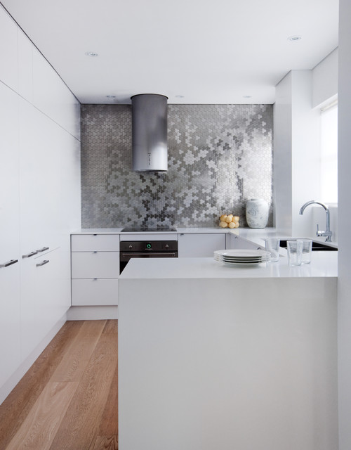
ID# 138030 | Houzz.com – Credit | © ALLOY Solid Metal Tiles
Stainless Steel Brushed Backsplash without Upper Cabinets in Contemporary Kitchen
Possessing a semi-reflective finish, this stainless-steel brushed backsplash without upper cabinets makes the whole swath of wall it is own. Paired with white clean line flat-front cabinets and sleek countertops, it relies on a neutral setup, while the lack of upper cabinets is easily compensated with full-height white cabinets that add a fourth arm to the U-shaped layout of the kitchen.

